Comparisons of wxmplot with other Python Plotting tools
Disclaimer: this section is essentially opinion of the lead author of wxmplot. While it aims to be fair, there is clearly a bias in this view to emphasize priorities that informed the development of wxmplot. If you have comments or suggestions for improving this section, please use the Github discussion page.
Data visualization and exploratory data analysis are important for working with
all kinds of scientific data. One of the aims for wxmplot, and especially
wxmplot.interactive, is to make exploratory data analysis with Python as
easy as possible for the end-user. Here I give a few comparisons of wxmplot
with some other tools and libraries for plotting scientific data with Python.
The main emphasis here is on Line Plots, basic plots of y versus x. While
other graphical displays of data are important, basic Line Plots are very
common across many scientific and engineering disciplines, and often the first
view of a datasset. All plotting library will support such plots,
For interactive exploratory data analysis and for displays of scientific data within data analysis applications, the following characteristics are vital:
brevity, or simplicity of code. We are using Python because it is succint and elegant.
beauty. The rendered plots should be high-quality with attractive fonts. Ideally, images made would be directly suitable for presentations and publications, without needing to export and re-create the plot with other software.
interactivity. After the plot or image of data is rendered, we want to be able to manipulate and modify the display, including zooming in on certain portions of the data, changing scales, color schemes, line types, and plot labels. In fact, not only do we want to do this, we want users of the plotting scripts and applications to be able to do this.
The comparisons with other packages here emphasize these three characteristics. In all cases, the interactivity of plots created with wxmplot and the ability of the end-user to manipulate the details of the display are simply unmatched. For basic line plots, the end-user can do all of the following:
change the color, linewidth, line type, marker type, marker size, and display order for each “trace” (x, y pair) in the plot.
change the color theme of the entire display, the color of each component of the display window, the size of the plot margins, and how to set the data display range.
change whether and where a legend is shown, whether grid lines are shown, and whether the plot is enclosed in a full box or only the left and bottom axes are drawn.
change the label for each trace, and the title and label for each axis, including setting font sizes.
change whether each axis is displayed linearly or logarithmically, and apply common manipulations such as showing derivative or y*x, 1/y, and so forth.
copy images to the system clipboard, save image to PNG file, or send directly to a system printer.
For image display, users can lookup tables for mapping intensity to color, set thresholds and contrast levels, as well as showing axes and setting the size and location of a scalebar, and its label. Images can be flipped, rotated (and reset). Smoothing of pixelated data can be adjusted. Images can be toggled back-and-forth between “image mode” and “contour mode”.
Comparison with Matplotlib.pyplot
To be clear, wxmplot uses matplotlib for plotting and image display. Any aspect of “beauty” in wxmplot comes from matplotlib, which makes plots and images of scientific data that are of excellent quality. Allowing LaTeX rendering for mathematical symbols and expressions in labels is particularly helpful for plotting data from the physical sciences. For clarity, I include the Seaborn package as essentially matplotlib with different theming (that can be used from wxmplot!).
Of course, matplotlib is much more comprehensive than wxmplot and supports some display types that wxmplot does not. wxmplot focuses its attention on Line Plots and display of grey-scale and false-color images, and essentially re-imagines the pyplot functions plot and imshow. But wxmplot also gives you access to the underlying matplotlib objects so that you can add more complex components and manipulate the plot as needed, assuming that you know the matplotlib programming interface.
In wxmplot Overview, a brief comparison of matplotlib.pyplot
and wxmplot.plot is given and will not repeated here. From the
point of view of “brevity” and “beauty”, these are approximately
equal. The matplotlib API is certainly much more common, and
deliberately mimics the plotting functions in Matlab, so will be
familiar to many people. wxmplot.plot puts a lot more
arguments into a small number of function calls, which can be
convenient but also somewhat harder to remember what all the options
are. The nature of plotting means there are many potential optional
arguments, and how those are accessed almostly certainly means a large
number of methods or keyword arguments.
Plots made with matplotlib.pyplot have limited interactivity and customizability after the plot is displayed with its Navigation Toolbar. The end-user can read plot coordinates as the mouse moves around, zoom in and out, pan around the plot area, and save the image. wxmplot includes all of those features, and has much more flexibility at run-time for the user to be able to manipulate the display of the data.
For completeness, the example using plain matplotlib would look like
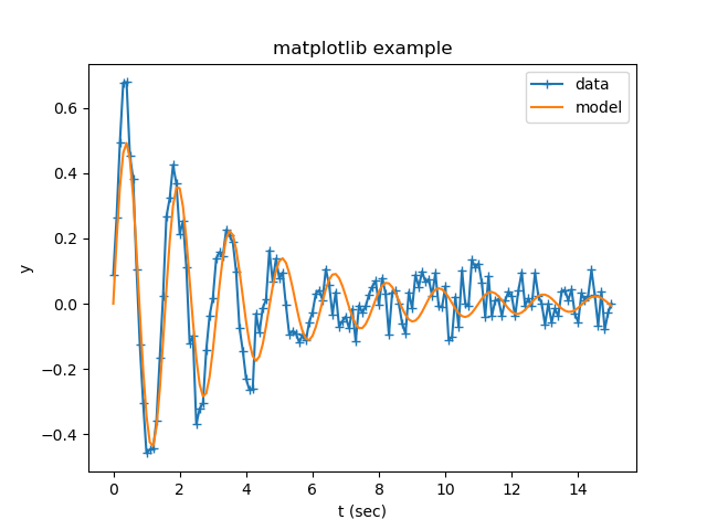
and with wxmplot the code would look like:
import numpy as np
import wxmplot.interactive as wi

np.random.seed(0)
x = np.linspace(0.0, 15.0, 151)
y = 4.8*np.sin(4.2*x)/(x*x+8) + np.random.normal(size=len(x), scale=0.05)
m = 5.0*np.sin(4.0*x)/(x*x+10)

wi.plot(x, y, label='data', marker='+', xlabel='t (sec)', ylabel='y',
        title='wxmplot example', show_legend=True)
wi.plot(x, m, label='model')
and give a result of
Comparison with WxPlot
The wxPython library comes with a plot submodule that supports basic line plots. An example of using this would be:
import wx
import numpy as np
from wx.lib.plot import PolySpline, PlotCanvas, PlotGraphics

class PlotExample(wx.Frame):
    def __init__(self):
        wx.Frame.__init__(self, None, title="wx.lib.plot example",
                           size=(700, 500))

        np.random.seed(0)
        x = np.linspace(0.0, 15.0, 151)
        y = 4.8*np.sin(4.2*x)/(x*x+8) + np.random.normal(size=len(x), scale=0.05)
        m = 5.0*np.sin(4.0*x)/(x*x+10)

        xy_data = np.column_stack((x, y))
        xm_data = np.column_stack((x, m))

        traces = [PolySpline(xy_data, width=3, colour='#1f77b4'),
                  PolySpline(xm_data, width=3, colour='#d62728')]
        canvas = PlotCanvas(self)
        canvas.Draw(PlotGraphics(traces))

if __name__ == '__main__':
    app = wx.App()
    PlotExample().Show()
    app.MainLoop()
and give a plot of
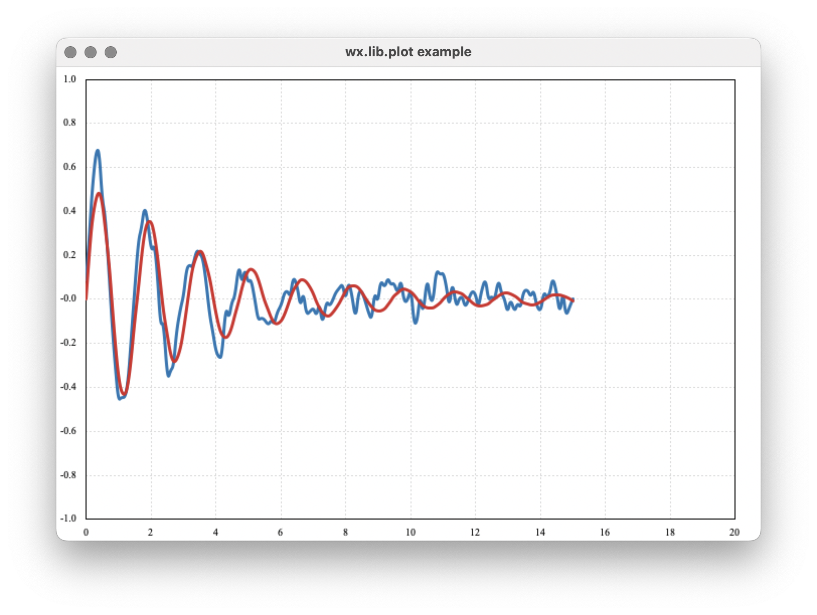
As written here, there is not interactivity, though zooming can be enabled. The need to create a subclass of a Frame and initiate a wxApp adds a fair amount of boiler-plate code which make it painful for simple scripts or exploratory data analysis.
Comparison with Plotly
The Plotly library includes a Python interface (https://plotly.com/python/) that is very good and renders interactive plots into a web browser. This is very useful for web-based applications and gives good looking and interactive plots into a local or remote web browser. Getting information back from the web-browser to an application or script is somewhat challenging. While Plotly claims to work well with a Jupyter notebook, there are persistent difficulties with getting latex to work, and little attention from Plotly developers.
Many of the Plotly examples make assumptions about using Pandas dataframes, which is a fine default, but makes working with lists and arrays a bit more complicated. For a simple plot of a single trace, Plotly could be used as:
import numpy as np
import plotly.express as px

np.random.seed(0)
x = np.linspace(0.0, 15.0, 151)
y = 4.8*np.sin(4.2*x)/(x*x+8) + np.random.normal(size=len(x), scale=0.05)
m = 5.0*np.sin(4.0*x)/(x*x+10)

data = {'x': x, 'y': y}
fig = px.line(data, x='x', y='y', title='example using plotly')
fig.show()
Which is pretty good for brevity and readability. But (as far as I can tell), the simplest way to repeat our example to show two traces together uses a bit more complicated code:
import numpy as np
import plotly.graph_objects as go

np.random.seed(0)
x = np.linspace(0.0, 15.0, 151)
y = 4.8*np.sin(4.2*x)/(x*x+8) + np.random.normal(size=len(x), scale=0.05)
m = 5.0*np.sin(4.0*x)/(x*x+10)

fig = go.Figure()
fig.add_trace(go.Scatter(x=x, y=y, name='data'))
fig.add_trace(go.Scatter(x=x, y=m, name='model'))
fig.update_layout( {'title': {'text': 'example using plotly'}})

fig.show()
That is a bit more complicated than using wxmplot, but not too bad. The resulting plot looks like
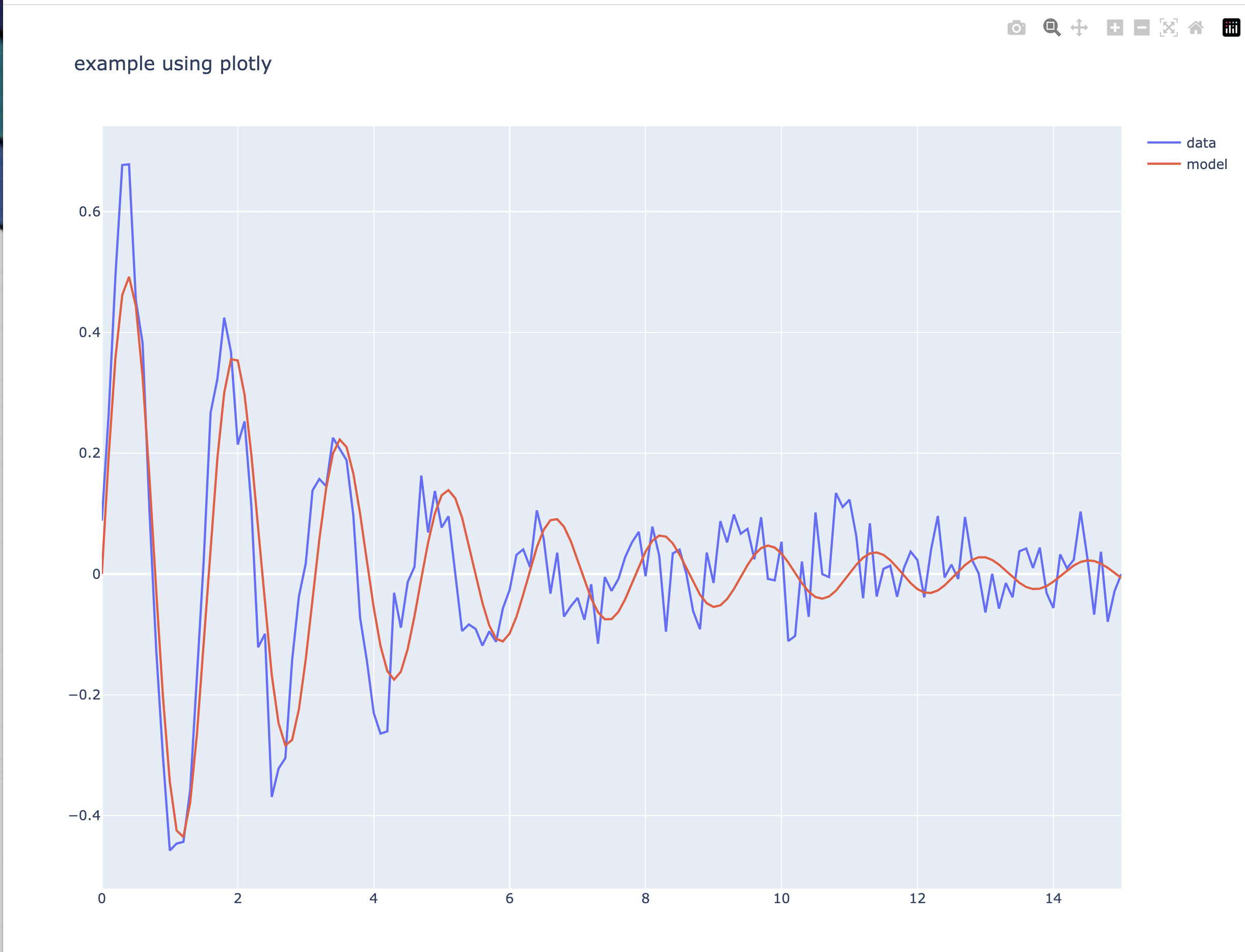
which is a decent starting point. Plotly also gives basic interactivity by default, including zooming and displaying coordinates of data points. Again, Plotly is especially well-suited to work with Pandas dataframes, and provides a fairly rich set of graphics types, so if you are looking to visualize complex datasets that are already in Pandas dataframes, Plotly is a good choice.
Comparison with PyQtGraph
Pyqtgraph (https://pyqtgraph.readthedocs.io/en/latest/) provides a very comprehensive library for plotting and visualization with PyQt and PySide. Constructing the example plot above with pyqtgraph would look like:
import numpy as np
import PyQt6
import pyqtgraph as pg

np.random.seed(0)
x = np.linspace(0.0, 15.0, 151)
y = 4.8*np.sin(4.2*x)/(x*x+8) + np.random.normal(size=len(x), scale=0.05)
m = 5.0*np.sin(4.0*x)/(x*x+10)

pwin = pg.plot(x, y, pen='#1f77b4', symbol='+')
pwin.plot(x, m, pen='#d62728')
pwin.setWindowTitle('Plot with PyQtGraph')
pwin.setLabel(axis='bottom', text='t (sec)')
pg.exec()
I see many applications using this library to produce good visualizations of data. I must also admit that I often struggle to get a working version of the PyQt library. For this example I find that it is important to select the PyQt “family” (here, PyQt6, but on some systems PySide6 appears to work more reliably) before importing pyqtgraph. That may depend some on operating system and environment. Being very familiar with wxPython and not very proficient with the Qt world, I would happily say that someone more proficient with PyQt might be able to make excellent use of this.
For brevity and clarity, this is pretty good, though I would hope that labelling axes could be simpler. The resulting plot looks like this
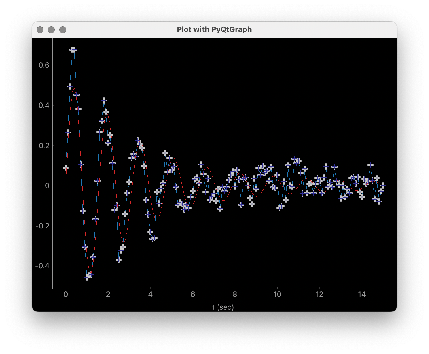
I find the quality of the Line plots to be signficantly worse than the plots made with matplotlib and wxmplot, and surprisingly poor given the wide-spread use of this library. The grey text on the black background in the plot is very hard to read. I see very little in the online documentation about labelling axes or improving layout or clarity. Even in the above example, adding labels is pretty klunky. This should be a concern for any scientist. But not being very familiar with pyqtgraph, I am not certain how to adjust things like margins and the sizes of markers and text, so I am willing to call some of these things a matter of taste and say they might be possible to improve.
The plots with pyqtqraph are interactive. Though perhaps not quite as customizable as wxmplot, it is much better than any other library described here and pyqtgraph definitely values user interaction with the data. To be clear, pyqtgraph is explicitly designed to do more than simple line plots.
Comparison with PyQtGraph/PythonGUIs
Here we compare to tutorials at https://www.pythonguis.com/tutorials/ which describe using using GUIs with the PyQt and PySide family of GUI toolkits based on Qt. The fact that these pages are advertised as showing how to make “simple and highly interactive plots” plots was the main inspiration for this chapter. I agree strongly with the quote introducing these tutorials:
One of the major strengths of Python is in exploratory data science and
visualization, using tools such as Pandas, numpy, sklearn for data
analysis and matplotlib plotting.
and I believe the authors of those tutorials mean well. But, when they also say:
In this tutorial we will walk through the first steps of creating a plot
widget with PyQtGraph
I am obligated to reply “There has to be a better way”.
It should be clear from the section above that pyqtgraph by itself is good, and satisfies our criteria of brevity and interactivity. But the example code given on these web tutorials is another matter. As the comparison with wxmplot below demonstrates, there is indeed a better way than is implied in those tutorials.
The tutorials at https://www.pythonguis.com/tutorials/ make a slight distinction between using PySide and PyQt6 (see https://www.pythonguis.com/tutorials/pyqt6-plotting-pyqtgraph/), which is perhaps further indication of a general problem in the “Python+ Qt” universe. For the discussion here, it adds a level of complication that cannot be good for brevity, beauty, or portability. The tutorials start with a “simple” plot. The code given for this is:
from PyQt6 import QtWidgets
from pyqtgraph import PlotWidget, plot
import pyqtgraph as pg
import sys
import os

class MainWindow(QtWidgets.QMainWindow):
    def __init__(self, *args, **kwargs):
        super(MainWindow, self).__init__(*args, **kwargs)

        self.graphWidget = pg.PlotWidget()
        self.setCentralWidget(self.graphWidget)

        hour = [1,2,3,4,5,6,7,8,9,10]
        temperature = [30,32,34,32,33,31,29,32,35,45]

        # plot data: x, y values
        self.graphWidget.plot(hour, temperature)


def main():
    app = QtWidgets.QApplication(sys.argv)
    main = MainWindow()
    main.show()
    sys.exit(app.exec())


if __name__ == '__main__':
    main()
producing a very, very basic plot. There are no links to the images available, but running this locally gives a plot of
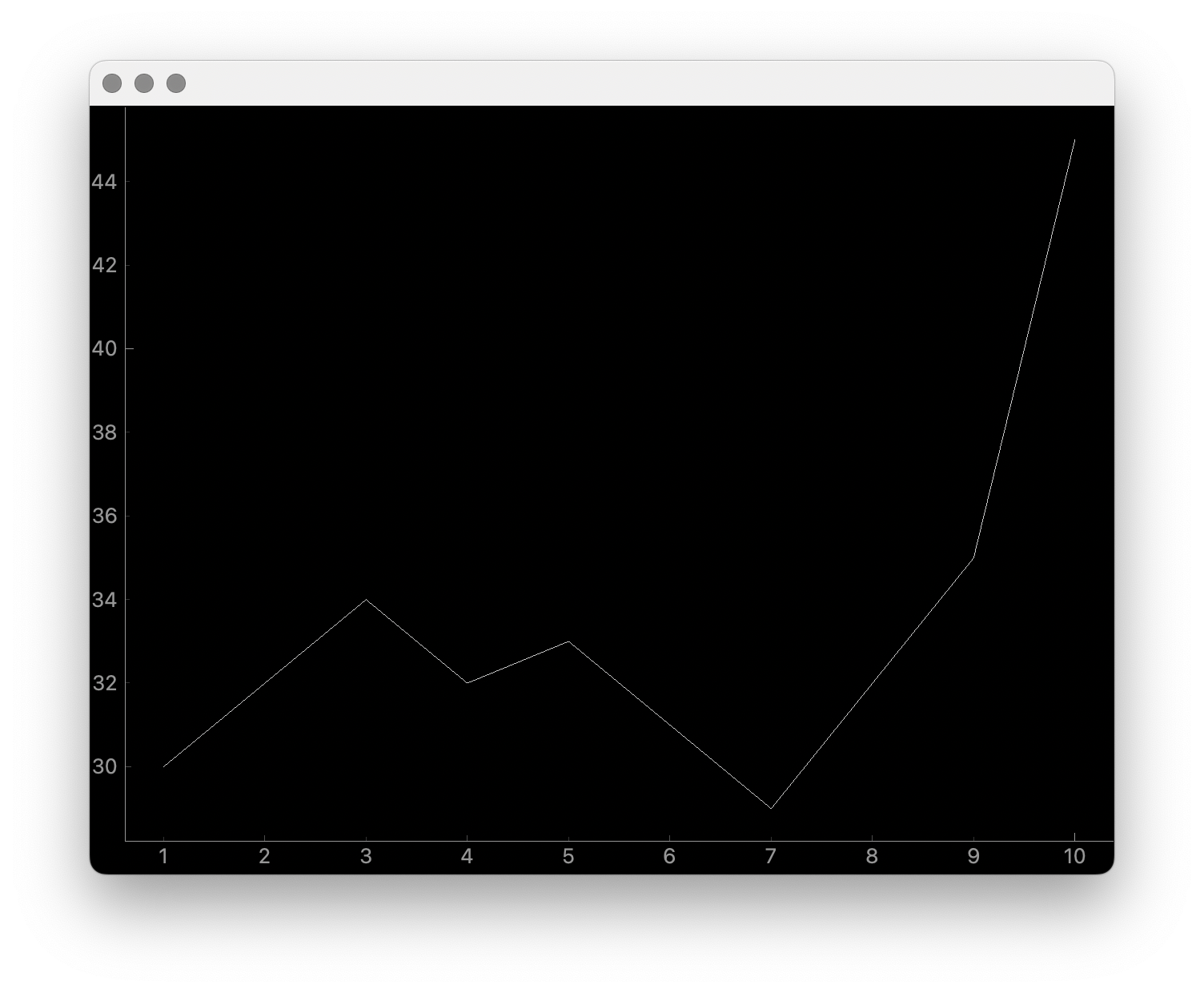
At 20 lines of code, this is hardly “brief”. The results are also just hard to see - the gray on black has poor contrast, the line joining the point is too thin and noticeably jagged. The code is just awful Python. With three levels of indentation, and with data is buried in the initialization method of a derived class that has no other methods defined, this is code that should never be done, and especially not in a tutorial. What rubbish, https://www.pythonguis.com/tutorials/!
With wxmplot, even creating an equivalent wxApp, that becomes:
from wxmplot import PlotApp

hour = [1,2,3,4,5,6,7,8,9,10]
temperature = [30,32,34,32,33,31,29,32,35,45]

plotapp = PlotApp()
plotapp.plot(hour, temperature)
plotapp.run()
With wxmplot.interactive it is down to 4 lines of code total:
from wxmplot.interactive import plot

hour = [1,2,3,4,5,6,7,8,9,10]
temperature = [30,32,34,32,33,31,29,32,35,45]

plot(hour, temperature, xlabel='hour', ylabel='temperature')
That is either 4 or 6 lines of code instead of 20 for the PyQt example. That difference matters, especially the stated goal of “exploratory data analysis”. As above, burying the data in the initialization method of a main window is just horrible code design, and especially disappointing to see in a tutorial. It make exploratory data analysis very hard.
In addition, the plot in the pythonguis example does not have axes labeled. This is a very serious problem for the display of scientific data. Axes should be labeled, always. The tutorials at https://www.pythonguis.com/tutorials/ don’t put a single label on any axes until half-way through the tutorial. This cannot be meant for serious students of science. As above, it is quite possible that PyQtGraph is just poor at labelling axes.
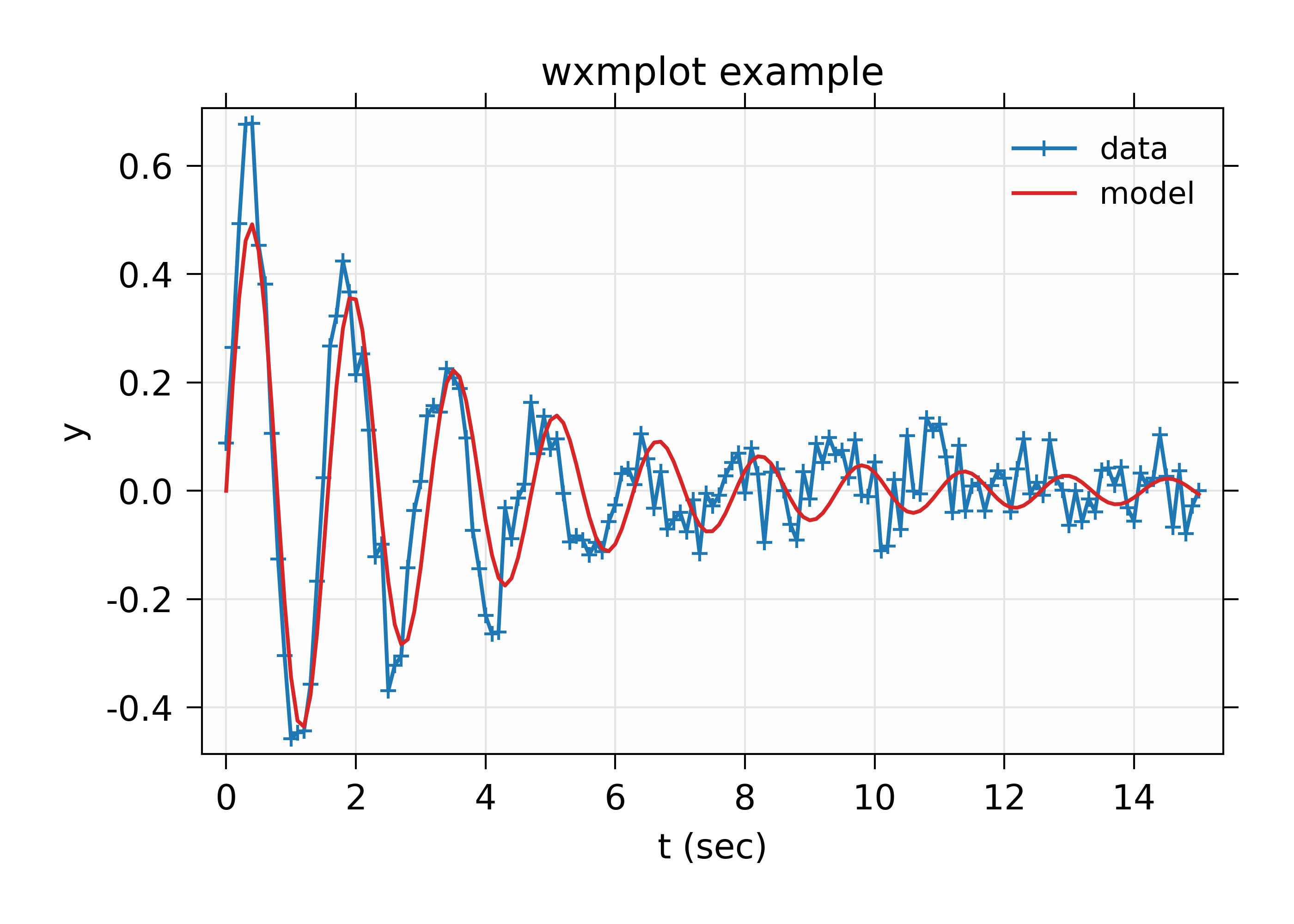
With wxmplot, the resulting plot looks like:
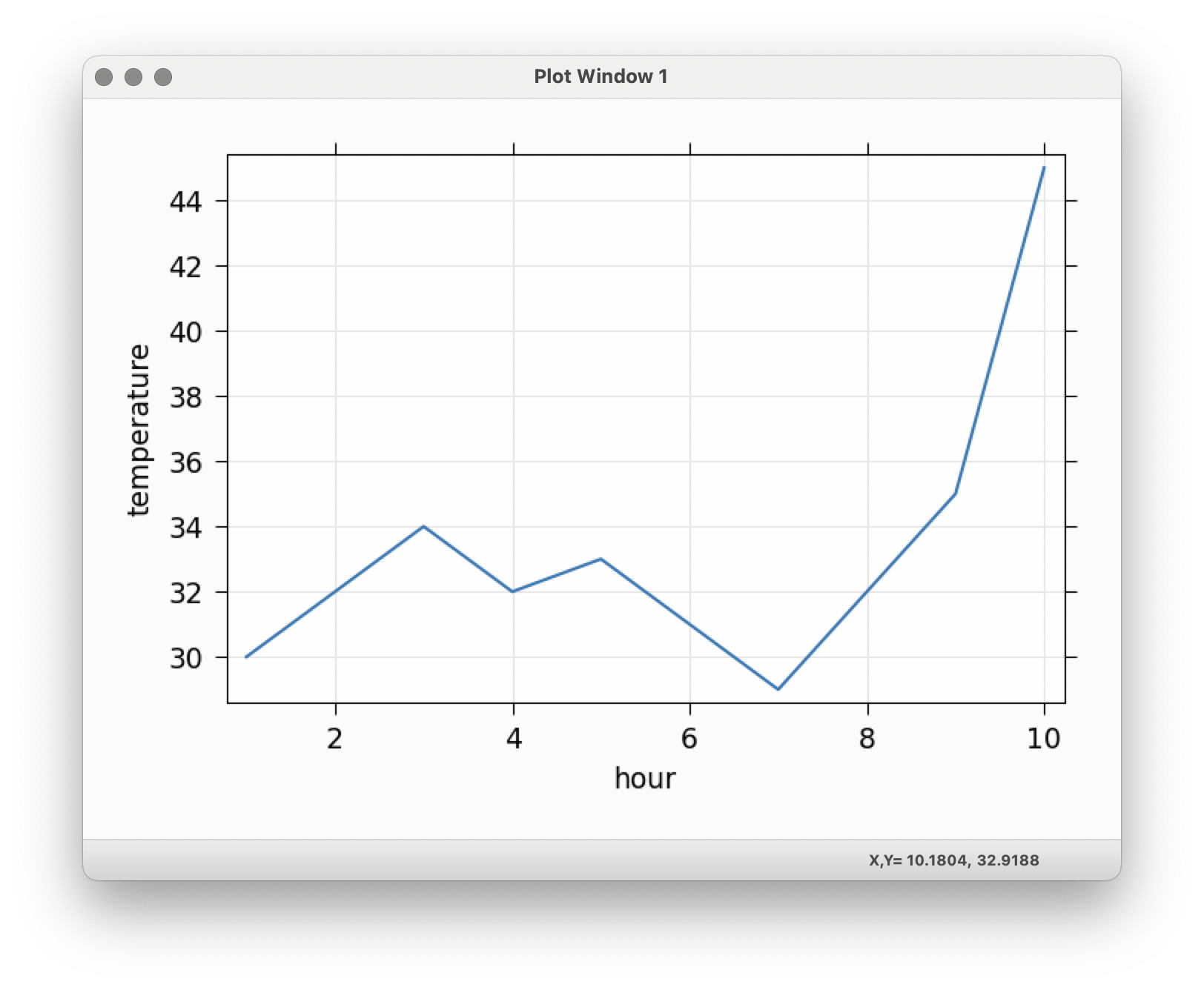
The axes are labeled, of course, the contrast is better. Because communication is the goal.
There is some basic interactivity with the Qt example in that the plot can be panned and zoomed. Some plot features can be altered by the end-user after the plot is displayed. A fair amount of the tutorial listed above covers changing colors of plot elements and color and line-style from within the code, perhaps adding code like:
self.graphWidget.setBackground('w')

pen = pg.mkPen(color=(255, 0, 0), width=5, style=QtCore.Qt.DashLine)
self.graphWidget.plot(hour, temperature, pen=pen)

styles = {'color':'b', 'font-size':'20px'}
self.graphWidget.setLabel('left', 'Temperature (°C)', **styles)
self.graphWidget.setLabel('bottom', 'Hour (H)', **styles)
and so on. With wxmplot such settings would be done with:
plot(hour, temperature, xlabel='Hour (H)', ylabel='temperature (°C)',
     bgcolor='white', color='red', style='dashed', linewdith=5,
     textcolor='blue')
Similarly, there is quite a bit of discussion in the pyqtgraph tutorial on how to display a legend for the plot. This is much simpler with wxmplot and more interactive, as the displayed legend is “active” in toggling the display of the corresponding line.
Given that the stated goal is to teach people how to use Python for interactive exploratory data analysis, the tutorials at https://www.pythonguis.com/tutorials/ are profoundly disappointing.
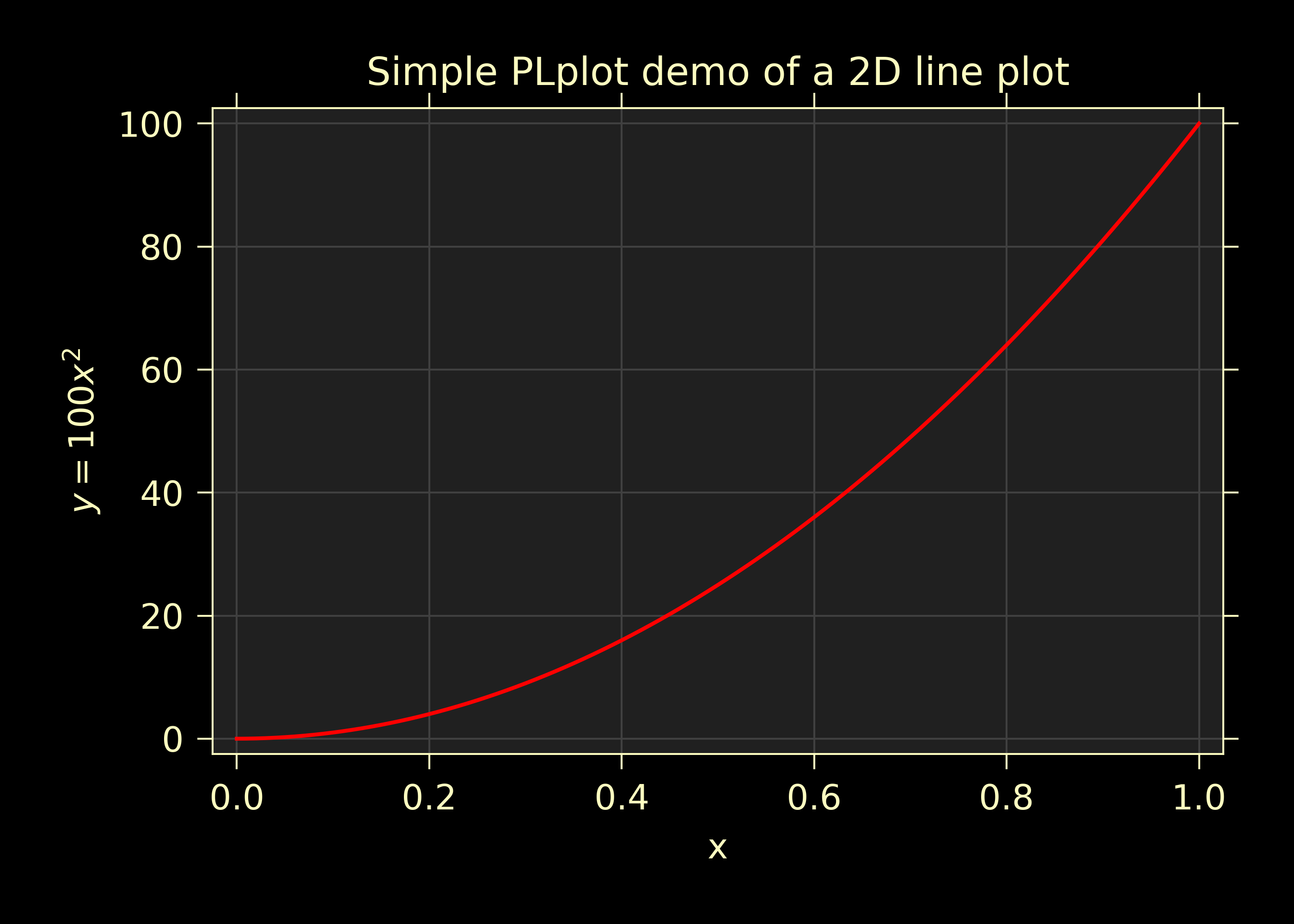
Comparison with PLPlot
PLPlot (http://plplot.sourceforge.net/) is a general purpose plotting library with bindings for many languages, including Python. It supports many plot types, including map displays which is outside the scope of wxmplot. Since it is not specifically written for Python, it is not too surprising that its Python interface is not quite as elegant as matplotlib or wxmplot. Their Python example for a basic line plot is:
from numpy import *

NSIZE = 101

def main(w):
    xmin = 0.
    xmax = 1.
    ymin = 0.
    ymax = 100.

    # Prepare data to be plotted.
    x = arange(NSIZE) / float( NSIZE - 1 )
    y = ymax*x**2

    # Create a labelled box to hold the plot.
    w.plenv( xmin, xmax, ymin, ymax, 0, 0 )
    w.pllab( "x", "y=100 x#u2#d", "Simple PLplot demo of a line plot" )

    # Plot the data that was prepared above.
    w.plline( x, y )

    # Restore defaults
    # Must be done independently because otherwise this changes output files
    # and destroys agreement with C examples.
    #w.plcol0(1)
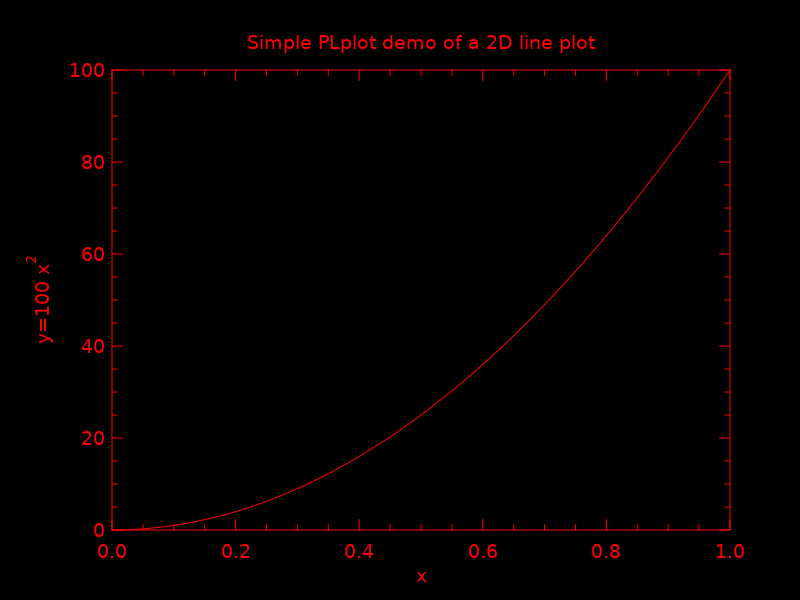
which is not too bad from the point of view of “brevity”. But it is actually not complete code. It is not clear how to actually run the example – some sort of import must be missing. The result at http://plplot.sourceforge.net/examples-data/demo00/x00.01.png is not too bad, though a bit hard to call “beautiful”. I believe PLPlot has essentially no interactivity for the plots themselves, though some programs may be able to have the user advance through a series of plots. It is also not clear how supported or actively maintained this library is.
Converting that to wxmplot would be:
import numpy as np
import wxmplot.interactive as wi

x = np.linspace(0, 1, 101)
y = 100*x**2

wi.plot(x, y, color='red', xlabel='x', ylabel=r'$y=100 x^2$',
        title="Simple PLplot demo of a line plot", theme='dark')
which gives a plot of
Comparison with Dislin
Like PLPlot, Dislin (https://dislin.de/) is a plotting library with bindings for many languages, including Python. It also supports many plot types, including 3-d volume displays which is outside the scope of wxmplot. Since it is not specifically written for Python, it is not too surprising that its Python interface is not quite as elegant as matplotlib or wxmplot. Their Python example for a basic line plot is:
import math
import dislin

n = 101
f = 3.1415926 / 180.
x = range (n)
y1 = range (n)
y2 = range (n)
for i in range (0,n):
  x[i] = i * 3.6
  v = i * 3.6 * f
  y1[i] = math.sin (v)
  y2[i] = math.cos (v)

dislin.scrmod ('revers')
dislin.metafl ('xwin')
dislin.disini ()
dislin.complx ()
dislin.pagera ()

dislin.axspos (450, 1800)
dislin.axslen (2200, 1200)

dislin.name   ('X-axis', 'X')
dislin.name   ('Y-axis', 'Y')

dislin.labdig (-1, 'X')
dislin.ticks  (9, 'X')
dislin.ticks  (10, 'Y')

dislin.titlin ('Demonstration of CURVE', 1)
dislin.titlin ('SIN (X), COS (X)', 3)

ic = dislin.intrgb (0.95, 0.95, 0.95)
dislin.axsbgd (ic)

dislin.graf   (0., 360., 0., 90., -1., 1., -1., 0.5)
dislin.setrgb (0.7, 0.7, 0.7)
dislin.grid   (1,1)

dislin.color  ('fore')
dislin.height (50)
dislin.title  ()

dislin.color  ('red')
dislin.curve  (x, y1, n)
dislin.color  ('green')
dislin.curve  (x, y2, n)
dislin.disfin ()
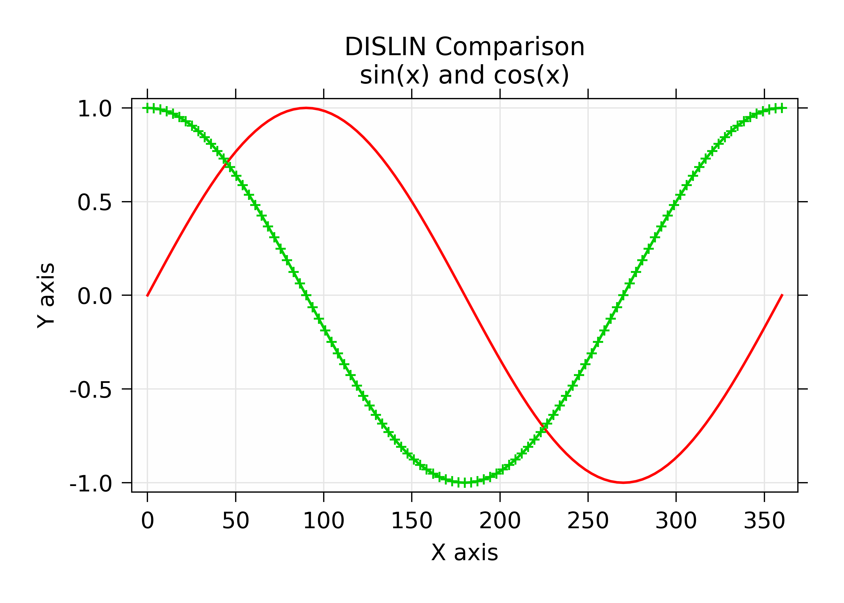
with a result at https://dislin.de/exa_curv.html. For “brevity” and “beauty”, this is difficult to recommend. I believe there is essentially no interactivity. Converting that to wxmplot would be:
import numpy as np
import wxmplot.interactive as wi

x  = 3.6*np.arange(101)
y1 = np.cos(np.pi*x/180)
y2 = np.sin(np.pi*x/18)0

wi.plot(x, y1, color='red', xlabel='X axis', ylabel='Y axis',
        title='DISLIN Comparison\nsin(x) and cos(x)')
wi.plot(x, y2, color='green3', marker='+')
and give a plot of
Conclusion
Succint code that is free of boilerplate code and that gives high quality plots and interactive displays is highly valuable for exploratory data analysis. While there are many plotting and visualization tools available for Python, many shown here are found lacking in at least one of code brevity, plot quality, or interactivity.
If you are are using web applications or want to embed plots in a web browser, plotly looks like a pretty good choice – to be clear, the author uses plotly for web applications. If you are using PyQt, pyqtgraph is an a perfectly reasonable choice, though the tutorials at https://www.pythonguis.com/tutorials/ should be avoided at all costs. For maximum portability, plain matplotlib.pyplot is an acceptable choice, though it offers relatively little in the way of interactivity.
If you are using looking for interactive exploration of your data, we hope you find that wxmplot offers important capabilities that enable script writers and end-users of applications to have rich interactions with their data.